Monday, 20 June 2011
Evaluation
All in all I really liked parts of this project like looking at line art but unfortunately I lost a lot of my files when my college USB broke so even though some parts ended up better then their old versions some were not a good. Looking back I'm rather proud with my results and character design and if I had to do the project again I would have spent far more time on the graphics's side and maybe done something cuter or that I would personally like as the target audience of my game are young boys and I know nothing about young boys really.
Map
For my game I decided to make a map with the stuff I learnt from looking at road signs. I decided on a total of 8 enemy area's in total marked with red dot's (I chose the colour red because it's often associated with anger) and one home point (marked with blue, a calmer colour). The main parts on the map are marked with simple symbols, for example a blue strip for a river, brown lines for the log tent and patches of dark and green for the woods. The only bid I don't like is the dried up river bed which isn't very easily recognised


Road signs

Today we looked in detail at road signs as they're a good example of simple images that even with not much detail can convey their meaning. The meanings are conveyed in a number of ways, the use of colour as well as simple shapes that represent things such as roads helps a great deal and also the use of a few choice words that can be read and understood at first glance. Some of the shapes are very very simple for example a triangle with an arrow pointing downwards immediately gets the idea of a slope across even though a hill is not shaped like that, that's the whole point, trying to find a compromise between realism and simple symbols.
Screenshots
For these screenshots I used reference from my character sketch and coloured it in in block colours with clean lineart. I then moved the file (saved as a PNG) to the background images open in photoshop and made a shadow by duplicating the layer, turning it black then using transform > distort to place it behind and to the right and finally setting the layer mode to overlay and lowering the opacity. This still looked a little out of place so I added a new layer with a clipping mask above the troll and made a shadow with the pen tool in black then set it to the same settings I used for the shadow, this made him look a little less out of place.

This was my first version but then I came up with the idea to simplify the background so I used the filter 'cutout' and it looked a lot better.


I really like how these images have turned out as using cutout not only simplify the background but it brought out more browns and darker green's which complimented the colours of the troll and also gave it a darker feel.
Character design Enemy Troll

This is my design for an enemy troll, at first he was bald but I decided hair made him look wilder, I then gave him the weapon of a bat with spikes instead of my original ideas of an axe because an axe would be too bloody. I also had some trouble choosing a colour scheme but in the end I went with the one on the left because it's higher contrast and more exiting.
Closeup art.
Today we started on reproducing certain parts of a plan, bug and animal three times but instead I did three plants, three animals and three bugs instead for more variety.

I like making these images and I really like some of the aspects I draw, for example the shiny skin from the frog, the feathers from the hawk and the shading on the berry, I fully intend to use stuff that iv'e learnt from this exercise, especially the frog's skin.
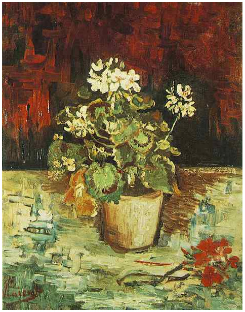
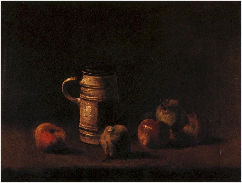
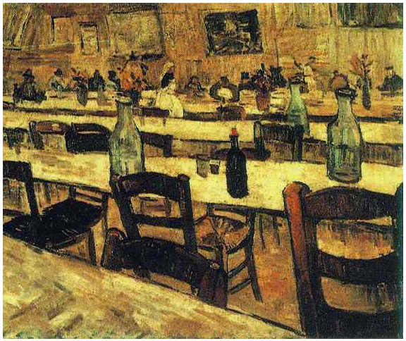
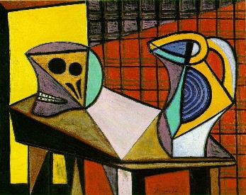
Artist research
The two artist's I decided to research are Vincent Van Gogh and Pablo Picasso and the way they incorporate and present everyday objects in their art. Gogh's art is mostly landscapes but sometimes he has objects like flowerpots, chairs, tables ect. in his artwork. These things look natural there and stay in the style of everything else so they look part of the picture, Picasso does a similar thing where he carries his theme not only to characters and backgrounds in his art, but props and such as well, giving the whole picture a good 'feel'.


Lineart

This is the first example of lineart I found, it's very simplistic and clean and made up of simple shapes, it wouldn't be much of a challenge to colour in. the lines are also all one size which add's to the simple bold look associated mostly with children's art as it is very easy to tell that this is a dolphin as well as the over exaggerated expression makes it easy to see how the dolphin 'feels'.

This lineart is far more realistic and detailed, there's also a good variation in line with which makes things like her lips and eyes stand out. It looks like it's been traded over an photograph but it still makes a good lineart as although some of the detail and the shading had to be remove it's still recognisable. The expression is a lot more human as well which adds to the realistic look, but, in my opinion there should be far more definition on the eye's and less on the eyebrow's which overshadows the eyes a lot being the thickest lines there. It would look a million times better with lines around the edge of the eyebrow instead, not blocked in, and the lower eye lashes drawn in to push the eyes forward.

This example is far more simplistic than the last and far more dramatic. The lineart doubling as shading really makes the image stand out with the high contrast and give the image a really dramatic feel. Unlike the first two images this has a lot of straight jagged lines which again adds to the feel.

This lineart is slightly more detailed as it is of a human being instead of a machine, it's still not as detailed as the realistic lineart but it's bold and easy to workout whats what. The line thickness doesn't really change that much and things like hair and cloths hardly have any lineart at all which is understandable as it's lineart for a cell shaded anime image where only really important folds in cloth and such are shown. The image has good impact though with the extra thickness around the eye's and edges which make the image a lot less 2D.

This image is probably the most detailed even though it's still anime style. The line thickness doesn't change much but it's okay as it's a calm themed image, and where the line doe's thicken/thin it's very effective, as like in most anime images the eyes are the main focus having the thickest lines, this looks really nice although with all the detail on the cloths it would be nice if they were a bit more detailed.
Monday, 23 May 2011
Last week we went to Dartmoor to get some pictures for our game. I have decided to aim my game at boys and base it around trolls/ogre's living in the countryside. I decided to have you play as a troll and the aim of the game is to take over the other troll's land by stealing their flag before they chase you away until you own all the land. Because of this idea I decided to focus on taking pictures on lairs for the trolls.

I chose this picture because it looks like a seat for a troll.

I chose this picture because it looks like a little shelter for a small troll.

This again looks like the hideout of a small troll.

I chose this shot so I could have a troll under a bridge like in the fairy tales.

I chose this shot for the same reason.

I chose this hot because I can draw the troll breaking through the wooden gate.

I thought this looked like a tiny hiding place for a tiny troll.

I liked this shot because this thing looks like a seat for a troll.

I chose this hot because it look's like a good wild path to somewhere.

I really like this image because you could have a troll living under the tree.

This was a shot I'm thinking of using for an angry troll so I can make it look like he upturned the tree.

This looked like a dark place where a troll might dwell so I chose to use it.

This is another shot where a tree has been uprooted and I was going to use it for an angry troll as well.

This was a nice shot of a branch where I was going to have a troll perched.

I really like this picture because it looks like a hut which would be good for a troll's house.

This again looked like a good place for a troll to be hiding.

This would be a good image to use for transitions between different area's on the game.

I liked these because they looked like little bath's for Trolls.

I only really chose this image because of the way the branch in the right corner is in focus while the rest is blurred.

I chose this image because I can made a troll break through the wall.
Monday, 9 May 2011


These three line drawings were made by me and based around a lion toy I brought it. I tried to keep the lineart as simple as possible and the keep it all relatively the same thickness since this image was for a child's game. The only place where the lineart was much thinner was the fur on his head which helps it have distinction from the rest of the fur to give it a more fluffy look, like hair. I also decided to have thicker lines for the nose, to give the face definition, the eyes, to make them stand out and the eyebrows to help show the emotions of the character.
All in all I think these images look good although the lienart could be a bit more neat.

This is one of the linearts I drew but with block colour's and I think it looks good. With the dark colours the bit's that stood out a bit too much like the nose blend in a lot more with the image. The brighter more saturated colours of they eyes also make them stand out more and be the main focus although they could be a bit brighter.

I like this image a lot less, probably because the shading is too thick in places like paws and mouth which looks very odd. The shadow around the eyes is good though as it helps up the contrast of the eyes which bring them forward more. I really don't like this image much but I think it would look better with colour.
Subscribe to:
Comments (Atom)